It’s hard to ignore all of the talk and articles about oil having a $100 target. That’s a significantly higher amount from where it trades now at roughly $72. The daily and weekly charts are filled with information. They can help guide in where resistance may be along with way as well as give other indications. A breakdown of the daily and weekly charts are below.
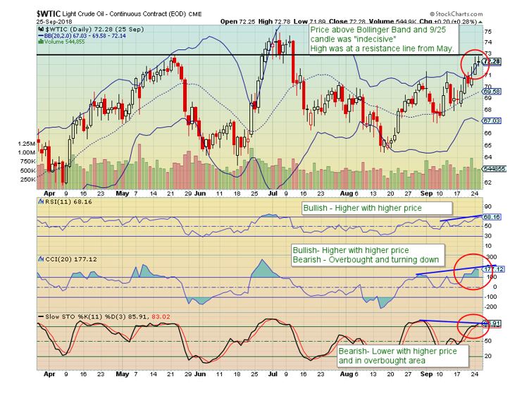
Daily Chart (as of 9/25/18)
-Price above Bollinger Band
-“Indecisive” candlestick after a 6.5% move in 5 days (low to high)
-Recent high is at resistance from May
-CCI and Slow Stochastics Oscillators in overbought territory
-RSI near overbought and at a high level overall
-Slow stochastics shows divergence – lower oscillator peaks with higher price peaks
-RSI and CCI have followed price – higher oscillator highs with higher prices
—These last 2 items are conflict with each other.

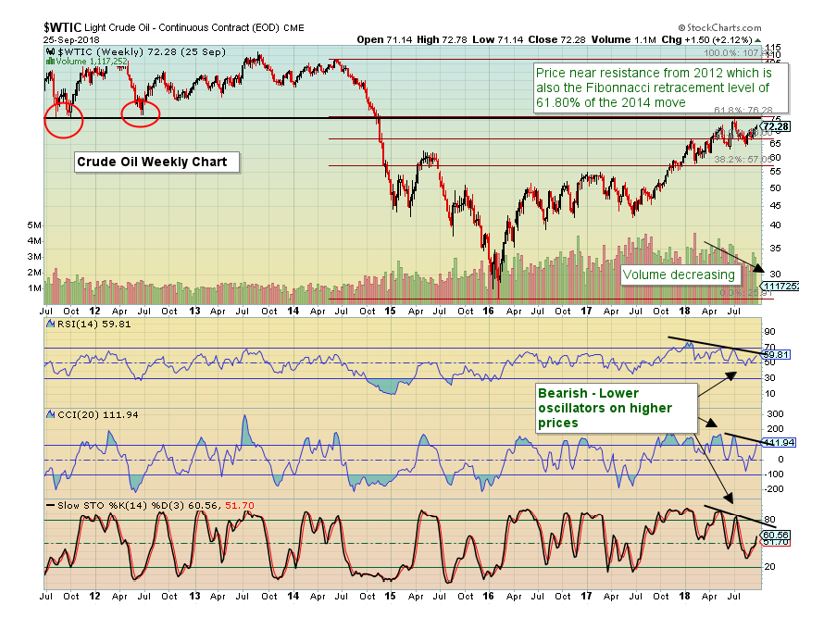
Weekly Chart
-Resistance level from 2011 & 2012 was recently touched and price retraced
-The 61.8% Fibonacci retracement level from the 2014-2016 move matches the above resistance line
-Volume has been decreasing on the move higher
-Oscillator divergence – Lower highs when price has been making higher highs

In summary, the daily chart has some conflicting items but shows the resistance line near $73. If this breaks and stays above, it’s time to revisit the charts for the next higher price targets. However when referring to the weekly chart, bearish signals are present.
The post Do the Crude Charts Match the News? appeared first on Catalyst Hedged Commodity Strategy Fund Blog.

