Why not be bullish on oil now? It had its best January ever and its strongest first quarter since the early 2000’s. Oil has advanced over 7% in the past 7 trading days. The price of crude oil is up over 50% since its December low and there have only been minimal retracements. The OPEC production cuts and unreliable supplies from Venezuela, Libya and Iran have all been strong bullish factors to boost price. The preceding factors build the big fundamental picture.
The production cuts have worked and certain goals have been met. According to CNBC’s energy reporter Tom DiChristopher, “In March, the Saudis took another 324,000 bpd off the market, bringing output to just under 9.8 million bpd and delivering on Energy Minister Khalid al-Falih’s vow to pump well below 10 million bpd…”
In more current developments, the EIA weekly report has shown reserve builds greater than expectations for the past 2 weeks. Even with this bearish news, price advanced. The current price curve is in backwardation, meaning that front month futures contract price is higher than futures prices later in the year. This condition is expected during a short-term supply crunch. One could get a higher price for selling oil now than in the future. With supply rising the past few weeks, the balance between supply and demand may be changing, so I look to the charts.
4 Charts for the Oil Bears
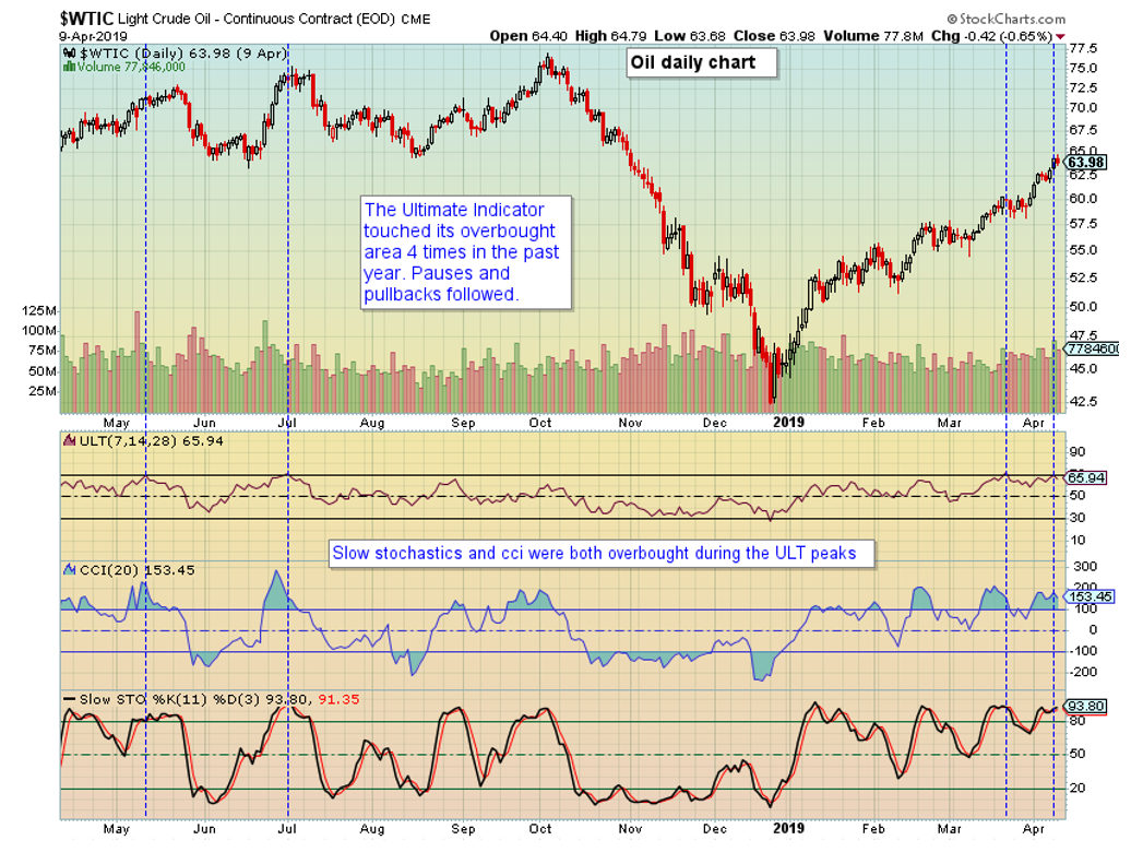
The first chart focuses on the Ultimate Oscillator Indicator (ULT). It is a momentum-based indicator across 3 time frames, and it is meant to be used in observing divergences. A divergence example is when price reaches a higher high, but the oscillator does not confirm with a higher high. When viewing its absolute reading, the chart demonstrates 4 times over the past year that it has touched the 70 mark and aligned with overbought conditions in both CCI and Slow Stochastics (vertical lines in blue). When viewing it for divergences, the 2nd and 4th lines are at higher prices than the 1st and 3rd lines, demonstrating divergences. The pullback after the 2nd dashed blue vertical line is clearly seen. If this 4th line is an actual divergence from the 3rd line, a decline in the near future could be expected.

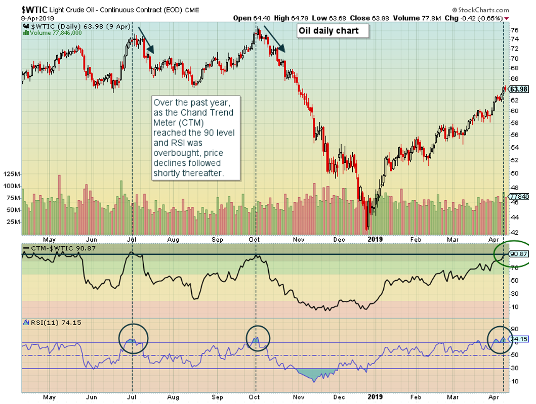
Focusing in on Chand Trend Meter (CTM), which Stockcharts.com describes as “assigns a numerical score to a stock or other security, based on several different technical indicators covering six different timeframes. Distilling all this technical information down into a single number provides an easy way to identify the strength of the trend for a given security”. A high reading translates into a strong trend. However, observing absolute levels over the past year, CTM has advanced above 90 three times during RSI’s overbought conditions. We are currently in the 3rd occurrence. The prior two events resulted in declines shortly thereafter.

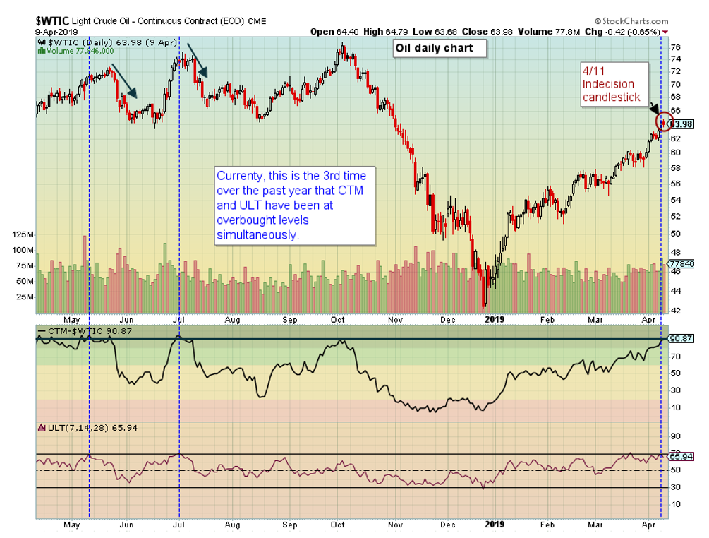
Chart 3 aligns the two indicators, both CTM and ULT. Current price action sits where CTM and ULT have both met their upper 90 and 70 levels only two other times over the past year. Meaningful declines followed both occurrences.

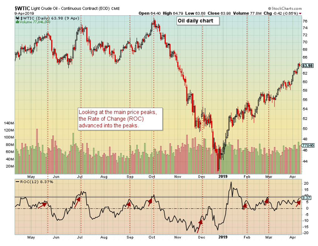
The 4th and last chart reviews the Rate of Change (ROC) over the past year leading into oil price peaks. Observing the chart, one can see sharp advances leading into the topping areas. Placing a horizonal line just above the current ROC reading and looking back, this level of ROC has been met with resistance in the past.

In summary, there are plenty of fundamental reasons to why oil has advanced to nearly $65 from the low 40’s in just over three months. Prices don’t advance or decline indefinitely. The above charts are meant to demonstrate ways that the easy money as of late may be coming to an end.
Note: Technical Analysis definitions and uses for indicators, oscillators, and other technicals can be found at schoolstockcharts.com/school.
The post For the Oil Bears…If There Are Any appeared first on Catalyst Hedged Commodity Strategy Fund Blog.

